It is well known that detailed visit information is usually displayed as X axis values in graphics. This leads to a problem of how to display character values in axes. This is exactly the topic of our post.
One Simple Graph by applying PROC Format to Display Character Axis Values
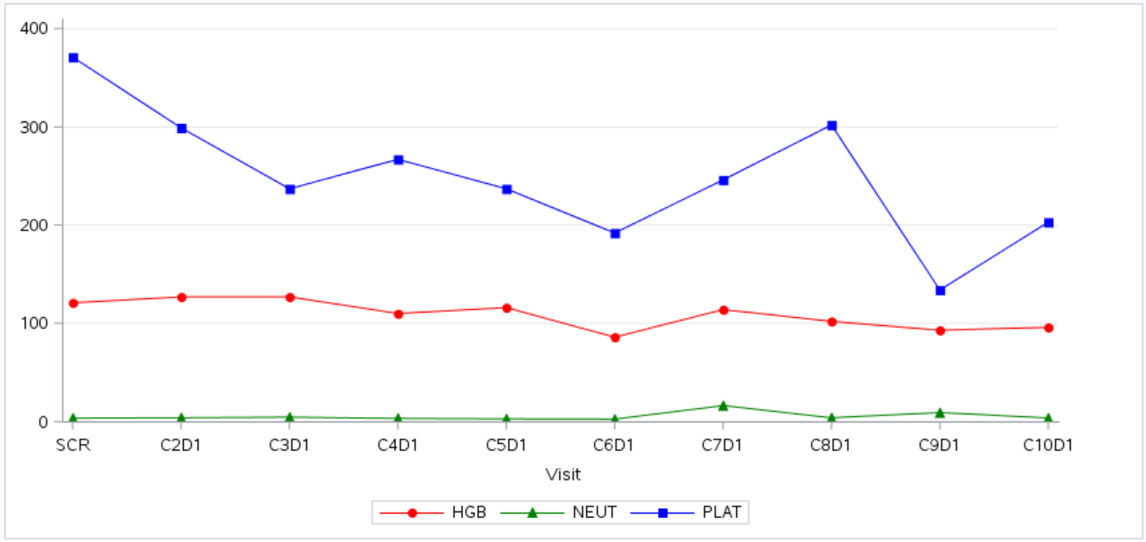
Let’s begin with the simplest example in which only one graph will be created by calling PROC SGRENDER. Here is part of laboratory data for subject 01-001. Laboratory assessment values AVAL will be displayed in Y axis while visit information AVISIT will be displayed in X axis.

The easiest way is to use AVISIT as X variables in SERIESPLOT statement.
Click here to hide/show code
proc import file=”&path/adlb.xlsx”
out=adlb replace
dbms=xlsx;
sheet=”ADLB”;
run;
proc sort data=adlb(where=(usubjid=”01-001″)); by usubjid paramcd ady; run;
proc template;
define statgraph plot;
begingraph/ designwidth=850px designheight=400px;
discreteattrmap name=”attrname_paramcd” / ignorecase=true;
value “HGB” /
markerattrs=GraphData1(color=red symbol= circlefilled)
lineattrs=GraphData1(color=red pattern = 1);
value “NEUT” /
markerattrs=GraphData2(color=green symbol= trianglefilled)
lineattrs=GraphData2(color=green pattern = 1);
value “PLAT” /
markerattrs=GraphData3(color=blue symbol= squarefilled)
lineattrs=GraphData3(color=blue pattern = 1);
enddiscreteattrmap;
discreteattrvar attrvar=attrgrp_paramcd var=paramcd attrmap=”attrname_paramcd”;
layout overlay/pad=(right=40)
walldisplay = none
yaxisopts=(display = (ticks tickvalues line)
griddisplay = on
offsetmin = 0)
xaxisopts=(label = “Visit”
griddisplay = off);
seriesplot x = avisit y= aval/display=(markers) group=attrgrp_paramcd name = “paramcd”;
discretelegend “paramcd”;
endlayout;
endgraph;
end;
quit;
proc sgrender data=adlb template=plot;
quit;
One Simple Graph by applying PROC Format
However, statistician would like distance of line between ticks in X axis to reflect real days between visits sometimes. Or statistician would like to add DOSE information, Adverse Event or even Concomitant Medication information in the same graph. In these situations, character variables like AVISIT cannot be used any more. We have to set numeric variable (e.g. ADY) as X variable in SERIESPLOT statement in most cases. And luckily, SAS offer PROC FORMAT to solve the problem. Graph will be exactly the same as above one and will not be displayed here again. The idea here is to apply TICKVALUEFORMAT option in XAXISOPTS statement.
Click here to hide/show code
proc import file=”&path/adlb.xlsx”
out=adlb replace
dbms=xlsx;
sheet=”ADLB”;
run;
proc sort data=adlb(where=(usubjid=”01-001″)); by usubjid paramcd ady; run;
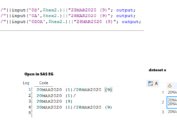
proc format;
value avisit
-6 = “SCR”
22 = “C2D1”
42 = “C3D1”
62 = “C4D1”
86 = “C5D1”
107 = “C6D1”
128 = “C7D1”
148 = “C8D1”
169 = “C9D1”
189 = “C10D1″
;
quit;
proc template;
define statgraph plot;
begingraph/ designwidth=850px designheight=400px;
discreteattrmap name=”attrname_paramcd” / ignorecase=true;
value “HGB” /
markerattrs=GraphData1(color=red symbol= circlefilled)
lineattrs=GraphData1(color=red pattern = 1);
value “NEUT” /
markerattrs=GraphData2(color=green symbol= trianglefilled)
lineattrs=GraphData2(color=green pattern = 1);
value “PLAT” /
markerattrs=GraphData3(color=blue symbol= squarefilled)
lineattrs=GraphData3(color=blue pattern = 1);
enddiscreteattrmap;
discreteattrvar attrvar=attrgrp_paramcd var=paramcd attrmap=”attrname_paramcd”;
layout overlay/pad=(right=40)
walldisplay = none
yaxisopts=(display = (ticks tickvalues line)
griddisplay = on
offsetmin = 0)
xaxisopts=(label = “Visit”
griddisplay = off
linearopts=(tickvalueformat = avisit.
tickvaluelist = (-6 22 42 62 86 107 128 148 169 189)));
seriesplot x = ady y= aval/display=(markers) group=attrgrp_paramcd name = “paramcd”;
discretelegend “paramcd”;
endlayout;
endgraph;
end;
quit;
proc sgrender data=adlb template=plot;
quit;
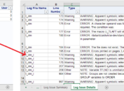
Multiple Graphs by applying SG Annotation + By Variable to Display Character Axis Values
TICKVALUEFORMAT is a good approach to display axis values when there is only one graph. It can also be used when there are multiple graphs and tick values on axis of all graphs are the same. What about multiple graphs with different tick values? If we still apply TICKVALUEFORMAT method, we have to create a separate format for each subject or each treatment group. This is obviously stupid when the number of subjects or number of treatment groups is large.
By applying SG Annotation, we can draw different tick values on different graphs with only one Annotate dataset. Here is an example that shows Lab data of two subjects 01-001 and 01-002. Tick values highlighted in yellow are difference across two subjects. And by comparing against the 1st and 2nd gray reference line, you can see that position of tick values are also different. Tick representing Day 153 in 2nd graph is after tick representing Day 148 in 1st graph. This is what statistician want. Tick position and distance between ticks can reflect real period.
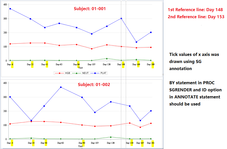
In this approach, we set color of tick values produced by XAXISOPTS to be white so that PROC TEMPLATE can leave enough space for us to draw tick values while at the same time only values drawn by SG Annotation are displayed. By statement and ID option in Annotate statement are very important and you can refer to this post for detailed description on ID option. Attribute of label and tick values can be defined in LABELATTRS and TICKVALUEATTRS options.
Click here to hide/show code
proc import file=”&path/adlb.xlsx”
out=adlb replace
dbms=xlsx;
sheet=”ADLB”;
run;
proc sort data=adlb; by usubjid paramcd ady; run;
data anno;
length function x1space y1space anchor label $200.;
set adlb;
retain function ‘text’ y1space ‘wallpercent’ layer ‘front’ textfont ‘Times New Roman’;
id = strip(usubjid);
textcolor = ‘black’;
textsize = 8;
width = 250;
x1space = ‘datavalue’;
y1 = -6;
rotate = 0;
anchor = “center”;
x1 = ady;
label = “Day “||strip(put(ady,best.));
output;
run;
proc template;
define statgraph plot;
dynamic _byval1_;
begingraph/ designwidth=850px designheight=400px;
discreteattrmap name=”attrname_paramcd” / ignorecase=true;
value “HGB” /
markerattrs=GraphData1(color=red symbol= circlefilled)
lineattrs=GraphData1(color=red pattern = 1);
value “NEUT” /
markerattrs=GraphData2(color=green symbol= trianglefilled)
lineattrs=GraphData2(color=green pattern = 1);
value “PLAT” /
markerattrs=GraphData3(color=blue symbol= squarefilled)
lineattrs=GraphData3(color=blue pattern = 1);
enddiscreteattrmap;
discreteattrvar attrvar=attrgrp_paramcd var=paramcd attrmap=”attrname_paramcd”;
layout overlay/pad=(right=40)
walldisplay = none
yaxisopts=(display = (ticks tickvalues line)
labelattrs=(size = 9 family = “Times New Roman”)
tickvalueattrs=(size = 9 family = “Times New Roman”)
griddisplay = on
offsetmin = 0)
xaxisopts=(label = “Visit”
griddisplay = off
labelattrs=(size = 9 family = “Times New Roman”)
tickvalueattrs=(size = 9 color=white family = “Times New Roman”)
);
seriesplot x = ady y= aval/display=(markers) group=attrgrp_paramcd name = “paramcd”;
annotate/id=_byval1_;
discretelegend “paramcd”;
endlayout;
endgraph;
end;
quit;
proc sgrender data=adlb sganno=anno template=plot;
by usubjid;
quit;