In last post, I introduced the process about how to develop a graph using GTL (Graph Template Language). Today this post will let you know how to control the graph appearance for group data. As I told you before, the default appearance features such as fonts, colors, line properties and marker properties are from the ODS style which you will apply to your output. Therefore, you can change the ODS style to change the graph appearance. Another way if to apply attribute maps (GTL concept). The example from our last post will be used to clarify the details.
Change ODS style to change graph appearance
Each style potentially can change the style attibute for GraphData1-GraphDataN. And you can create a customized style if you have certain preferences for grouped data items. Most styles define (or inherit) GraphData1 to GraphData12 styles elements. Generally speaking, these style elements are enough for graph programming in clinical industry. However, if you need more elements, you can add as many as you desire, starting with one more than the highest existing element (for example, GraphData13) and numbering them sequentially thereafter. For our example, there are only two groups of data. Therefore, we only need to change the style attribute for GraphData1 and GraphData2.
Here is the full code showing you how to define an ODS style named test, how to define a graph template named line and then how to appy these style and template to output data. CONTRASTCOLOR is the attribute applied to grouped lines and markers. COLOR is the attribute applied to grouped filled areas such as bar charts or grouped ellipses. Here I have to remind you that when you define color for an element that do not have filled area, you only need to define CONTRASTCOLOR.
Click here to hide/show code
*Define ODS style;
proc template;
define style test;
parent=styles.listing;
style GraphData1/
contrastcolor=red
color=red
linestyle=1
markersymbol=”CircleFilled”
markersize=7pt;
style GraphData2/
contrastcolor=black
color=black
linestyle=3
markersymbol=”DiamondFilled”
markersize=7pt;
end;
run;
*Define Graph Template;
proc template;
define statgraph line;
begingraph;
entrytitle “Line Plot”;
layout overlay/yaxisopts=(label = “Height”
offsetmin = 0.02
offsetmax = 0.02
linearopts =(tickvaluelist=(50 55 60 65 70 75)
viewmin = 50 viewmax = 75))
xaxisopts=(label = “Age”
offsetmin = 0.02
offsetmax = 0.02
linearopts =(tickvaluelist=(11 12 13 14 15 16)
viewmin = 11 viewmax = 16));
scatterplot x=age y=mean/group = sex name = “c”;
seriesplot x=age y=mean/group = sex name =”l”;
mergedlegend “c” “l”/title = “Sex Group”
location = outside
halign = center valign = bottom
border = false;
endlayout;
endgraph;
end;
run;
*Create Output Data;
proc sort data = sashelp.class out = class;
by sex age; run;
ods exclude all;
proc means data = class mean noprint;
by sex age;
var height;
output out = dist(drop = _type_ _freq_)
mean = mean;
run;
ods exclude none;
*Associate ODS style, Graph template to Output Data;
ods html style=test;
proc sgrender data=dist template=line;
run;
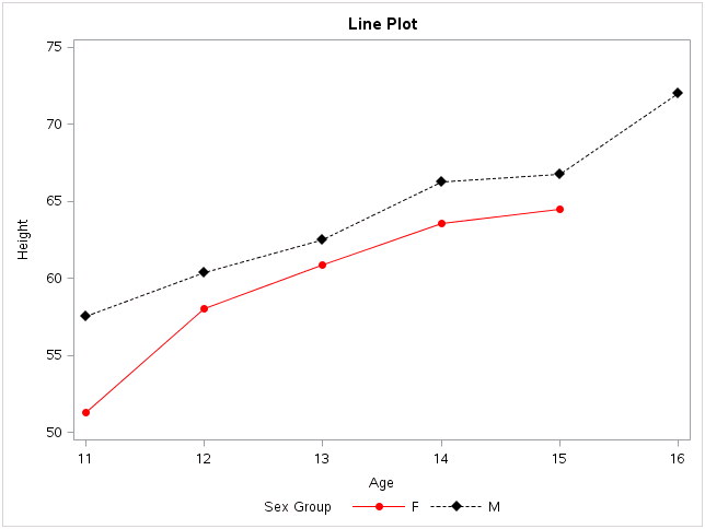
If you open the result window, you will get a plot like below. Color for Female group is red while color for Male group is black. This is in consistence with what we defined in ODS style. Similarly, we define line pattern and marker symbol to be 1 and circlefilled for GraphData1. For GraphData2, the line pattern and marker symbol are 3 and diamondfilled, respectively. This is actually what we got from our plot.
Changing the order of the data will change the order in which the group values appear on the plot. It also changes their association with GraphData1-GraphDataN style elements. In our example DIST dataset, data for Female group is before data for male group. That’s why we got GraphData1 attribute for Female group while GraphData2 attribute for Male group.
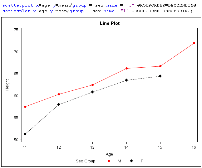
If you add option GROUPORDER=DESCENDING in scatterplot and seriesplot statement. You will get a figure as below. In the legend area at the bottom of the graph, Male group is before Female Group. And the attributes is in contrary of those in above graph. This is because that data for male group is before data for female group. Data for male groups will apprear first and therefore it is in the first place in legend area. It is also assicaite with GraphData1 attributes and the color is red.
Apply Discrete Attribute Maps to control graph appearance
A discrete attribute map enables you to consistently assign attributes to specific values of a numeric or character column in a dataset. To create and use a discrete attribute map, you must deal with three parts: DISCRETEATTRMAP block, DISCRETEATTRVAR statement and your plot statement (scatterplot and series plot in our example).
DISCRETEATTRMAP block is to assocaite values of a numeric or character column in a dataset with your desired attibutes. In our example, we will associate values of SEX variable from DIST dataset with our attributes. In DISCRETEATTRMAP block, we need to give our attribute map a name(sexname in our case). This attribute map name will be associated with variable from output dataset (SEX variable from DIST dataset in our example) in DISCRETEATTRVAR statement. And In DISCRETEATTRVAR statement, we also need to create attrvar (sexattr in our example) which will be used in plot statement. In plot statement, we can apply GROUP = our ATTRVAR value (sexattr in our example) to define the appearance of our grouped data. An eqivalence attribute map to our above ODS style GrpahData1 – GraphData2 is as below.

Here is the full code and you can see that no ODS style is defined here.
Click here to hide/show code
*Define Graph Template;
proc template;
define statgraph line;
begingraph;
entrytitle “Line Plot”;
discreteattrmap name=”sexname” / ignorecase=true;
value “F” /
markerattrs=GraphData1(color=red symbol=circlefilled)
lineattrs=GraphData1(color=red pattern=1);
value “M” /
markerattrs=GraphData2(color=black symbol=Diamondfilled)
Lineattrs=GraphData2(color=black pattern=3);
enddiscreteattrmap;
discreteattrvar attrvar=sexattr var=sex attrmap=”sexname”;
layout overlay/yaxisopts=(label = “Height”
offsetmin = 0.02
offsetmax = 0.02
linearopts =(tickvaluelist=(50 55 60 65 70 75)
viewmin = 50 viewmax = 75))
xaxisopts=(label = “Age”
offsetmin = 0.02
offsetmax = 0.02
linearopts =(tickvaluelist=(11 12 13 14 15 16)
viewmin = 11 viewmax = 16));
scatterplot x=age y=mean/group = sexattr name = “c” ;
seriesplot x=age y=mean/group = sexattr name =”l” ;
mergedlegend “c” “l”/title = “Sex Group”
location = outside
halign = center valign = bottom
border = false;
endlayout;
endgraph;
end;
run;
*Create Output Data;
proc sort data = sashelp.class out = class;
by sex age; run;
ods exclude all;
proc means data = class mean noprint;
by sex age;
var height;
output out = dist(drop = _type_ _freq_)
mean = mean;
run;
ods exclude none;
*Associate ODS style, Graph template to Output Data;
proc sgrender data=dist template=line ;
run;
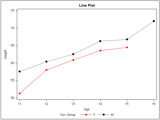
And this is the final output which is the same as our first graph in this post.