Today this post will present you how to develop a scatter plot using GTL (Grahp Template Language). To create a graph using GTL, you need to develop a template at first and then run SGRENDER procedure to associate the appropriate data with the template.
Qucik look at the a GTL definition
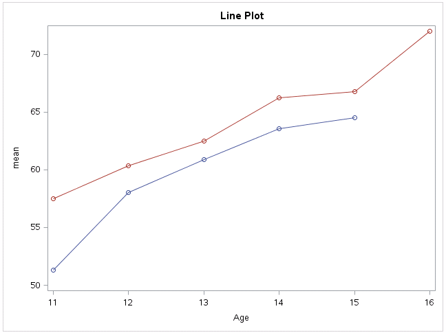
Suppose that we want to make a plot that displays mean of heigh by sex and age for SASHELP.CLASS. Below code can help you complete the task. There are three sections. The first section is to create template. The second section is to produce summary statistics. The third section is to associate the template and dataset named DIST which contains mean of height, sex and age. These three variables will be used to produce our plot.

From above code, you can see that template definition is consists of different blocks. GTL syntax block starts from BEGINGRAPH and ENDGRAPH and is the outermost block. The next level of block starts from BEGINGRAPH and ENDGRAPH. It is the outermost container for the graph and you can use various statements to define the content of the graph whithin this block. In our example, we specified graph title and layout block. The layout block begins with LAYOUT OVERLAY statement and ends with ENDLAYOUT statement. Within this block, it allows you to define the type of graphical layout to be used and specify graph content. From our above example, you can see that we put a seriesplot and scatter plot in our layout block. By submiting above code, we can get below figure.
How to customize X and Y axes
You can see that above GTL program automatically managed both X and Y axes are automatically managed for you. It determined which axes are displayed, the axis type, data range of each axis, label of the axis and even font size, font color of tick values. What if you want to customize axis feature based on your preferences? This part will introduce axis features and related programming options that are available to you for changing the behavior.
Axis Terminology
Each axis has follow features and they can be selectively displayed using the option or setting that is shown in the second column of below table.
| Axis feature | GTL options or settings |
| Axis line | LINE |
| Axis label | LABEL |
| Tick marks | TICKS |
| Tick values | TICKVALUES |
| Grid lines drawn perpendicular to the axis at tick marks | GRIDDISPLAY |
| Gaps at the beginning and end of the axis | OFFSETMIN & OFFSETMAX |
Primary and Secondary Axes
LAYOUT OVERLAY container supports two horizontal (X and X2) and two vertical (Y and Y2) axes. X axis is the bottom axis while X2 is the top axis. Y is the left axis and Y2 is the right axis. By default, X axis and Y axis will be displayed and they are referred to as the primary axes. As for X2 and Y2 axes, they are referred to as secondary axis and will be displayed only if they are requested. Let’s look at our above layout block.
Click here to hide/show code
layout overlay;
scatterplot x=age y=mean/group =sex;
seriesplot x=age y=mean/group =sex;
endlayout;
It means as below explicitly.
Click here to hide/show code
layout overlay;
scatterplot x=age y=mean/group =sex xaxis=x yaxis=y;
seriesplot x=age y=mean/group =sex xaxis=x yaxis=y;
endlayout;
Let’s request that both X and Y columns be mapped to the X2 and Y2 axis by replacing above code as below:
Click here to hide/show code
layout overlay;
scatterplot x=age y=mean/group =sex xaxis=x2 yaxis=y2;
seriesplot x=age y=mean/group =sex xaxis=x2 yaxis=y2;
endlayout;
You will get a plot like below.

Specify Axis options
You can use following syntax to set axis options. You can see that each axis has its own separate set of options and the option specifications must be enclosed within parentheses. Here listed some available options for X axis. And these options are also available to other axes.

DISPLAY = keyword |(feature-list) is to control what four features of axis will be displayed. Values of keyword such as STANDARD and ALL are equivalent to specifying the full list – (LINE TICKS TICKVALUES LABEL). While keyword NONE is to completely suppress ticks, tickvalues and label of the axis. This is equivalent to DISPLAY = (LINE).
GRIDDISPLAY = ON can enable grid lines to be displayed on the axis. In our above figure, we only request this option for X axis and therefore the grid lines will only be displayed on X axis. GRIDATTRS can specify the attributes of grid lines.
LABEL = and LABELATTRS = can be used to specify label of axis and the attributes such as font color or font size of label.
TYPE= can be ignored if axis type can be determined by plot statement. Usually a linear, time or discrete axis type can be determined automatically by plot statement. Howverve, a LOG axis is never automatically created and you have to explicitly declare the axis type with the TYPE = LOG option.
You should set axis data range & tick values based on your axis type. For example, if your axis type is linear then you should apply LINEAROPTS. Other statements such DISCRETEOPTS, TIMEOPTS can be used for discrete and time axes. TICKVALUELIST = (value) can enable you to specify tick values to be displayed along the axis. VIEWMIN = and VIEWMAX = suboptions can be used to extend or reduce the axis data range. TICKVALUEATTRS and TICKSTYLE are to control attributes of tick values and ticks.
THRESHOLDMIN/THRESHOLDMAX/OFFESTMIN/OFFSETMAX will be describes later in other posts.
How to control Graph Appearance
If you go back to our result plot, you will see that the markers are circles with different colors. What if you want to change the marker symbol to be squares? Or change marker color and even line color, line pattern?
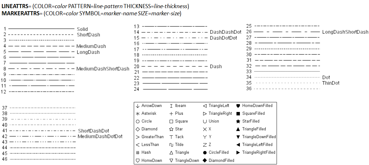
Well, graphs that are produced with GTL get their general default appearance features such as fonts, colors, line properties and marker peoperties from current ODS style. Appearance of the graph changes when the template is executed instead of when it is compiled. And this is the reason why we can got different graphs from different ODS destinations. Luckily, we can customize GTL options to override similar appearance contained in the ODS style. Here I only introduce GTL syntax about how to customize line and marker attributes using GTL options as shown in below figure. I also listed values for line patterns and marker symbols. As for style attibutes, we will introduce later as it is complex and is not our focus point here.
For grouped data which will have different attributes, we can use GROUP = option in plot statement. It will automatically used the style elements GraphData1 to GraphDataN for the presentation of each unique group value. Please note that if you want to control the appearance of Grouped data, you have to change the style attributes for GraphData1-GraphDataN. Another chioce is to use attribute maps. Both of them will be described later in future.
How to Add Legend
A graphical legend provides a description of marker symbols, lines and other data elements that are displayed on a graph. When a plot contains grouped data or lines that differ by color, marker symbol and line pattern, a legend must be used. There are also other situaitons in which legends should be applied. Anyway, legend is a key element for a graph and we have to master it.
There are two types of legends: DISCRETELEGEND and CONTINUOUSLEGEND. DISCRETELEGEND contains one or more legend entries. Each entry consists of a graphical item such as line, marker and corresponding text that eplains the items. While CONTINUOUSLEGEND maps a color gradient to response values. When markers vary in color to show the values of a response variable or when contour/surface plot use gradient fill colors to show the values of response variable, a continous legend must be applied.
Here is the syntax for using legends. Generally speaking, we have to assign a unique, case-sensitive name to plot statement and then referen that name on the legend statement.

LEGENDLABEL in plot statement are the values/text for corresponding items. VALUEATTRS can determine the text properties of legend labels.
LOCATE determines whether the legend is drawn insider the plot wall or outside the plot wall. The default is outside. HALIGN determines horizontal alignment while VALIGN determines vertical alignment. AUTOALIGN option can only be used when LOCATION = INSIDE. This option can be used to automatically postion an inside legend. It enables you to specify an ordered list of positions (TOPLEFT, TOP, TOPRIGHT, LEFT, CENTER, RIGHT, BOTTOMLEFT, BOTTOM and BOTTOMRIGHT) for the legend. The first of the listed positions that does not involve data collision is used.
OPAQUE determines whether the legend backgroud is 100% transparent or 0% transparent. BACKGROUDCOLOR determines legend backgroud color.
TITLE can enable you to add a title to the legend. TITLEATTRS can determine the text properties of legend title. TITLEBORDER = TRUE can enable you to add a diving line between legend title and legend body.
Please note that BORDER can determine if to remove the boder around the legend. The BORDERATTRS= can enable you to specify the line attribute of the border.
Sample code for customization and final output
Here is a sample code demonstrating on how to customize axes and add legend.
Click here to hide/show code
proc template;
define statgraph line;
begingraph;
entrytitle “Line Plot”;
layout overlay/yaxisopts=(label = “Height”
offsetmin = 0.02
offsetmax = 0.02
linearopts =(tickvaluelist=(50 55 60 65 70 75)
viewmin = 50 viewmax = 75))
xaxisopts=(label = “Age”
offsetmin = 0.02
offsetmax = 0.02
linearopts =(tickvaluelist=(11 12 13 14 15 16)
viewmin = 11 viewmax = 16));
scatterplot x=age y=mean/group = sex name = “c”
markerattrs=(symbol = circlefilled);
seriesplot x=age y=mean/group = sex name =”l”
lineattrs=(pattern = 3);
mergedlegend “c” “l”/title = “Sex Group”
location = outside
halign = center valign = bottom
border = false;
endlayout;
endgraph;
end;
run;
proc sort data = sashelp.class out = class;
by sex age; run;
ods exclude all;
proc means data = class mean noprint;
by sex age;
var height;
output out = dist(drop = _type_ _freq_)
mean = mean;
run;
ods exclude none;
proc sgrender data=dist template=line;
run;
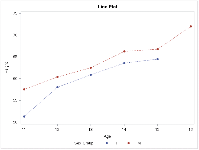
After submiting above code, you will get a figure like below. Here we applied <b>mergedlegend</b> statement and that’s why you can a merged legend. By comparing against the first plot, you will find that the maximum tick values for Y axis is 75 instead of 70. Plus, the marker symbol and line pattern were also changed.


Everything is very open with a clear clarification of
the issues. It was really informative. Your site is extremely helpful.
Thank you for sharing!