When a plot contains grouped markers or contains lines that differ by color, marker symbol or line pattern, a legend should be added into the plot. Plus, a legend also should be used when a surfact plot applies gradient fill colors to show values of a response varaible. Today in this post, I’d like to show you how to create legend using GTL (Graphical Template Language).
Introduction to the two types of legends
Generally speaking, there are two types of legends: Discrete legend and Continous legend. A discrete legend contains one or more legend entries. Each one of those entries consists of a graphical item such as markers, lines and corresponding text which is meant to explain the item. While a continuous lengend can map a color gradient to response values. The legend at the top panel of below figure is an example of discrete legend while the legend at the bottom is an example of continous legend.

How to create legend
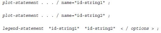
The basic idea of creating legend is to assign a unique, case-sensitive name to one or more plot statements and then to associate those plot statements with a legend statement by referencing that name on the legend statement. Here is the syntax of how to link plot statements and legend statement. Please note that plot statement can be SCATTERPLOT, SERIESPLOT, ect. As for legend statement, we can use DISCRETELEGEND, CONTINUOUSLEGEND and even MERGEDLEGENG.
Here are the listed options in legend statement which can be used to customize legend position, legend items attribute.
| Placement Options | LOCATION = INSIDE|OUTSIDE | Determines whether the legend is drawn inside or outside the plot wall. The default is OUTSIDE. |
| HALIGN = LEFT|CENTER|RIGHT | Determinesthe horizontal alignment and the default is CENTER. | |
| VALIGN = TOP|CENTER|BOTTOM | Determines vertical alignment and the default is CENTER. | |
| AUTOALIGN (only to automatically position an insided legend) | This option can enable you to specify an ordered list of potential postions for the legend. The list keywords include TOPLEFT, TOP, TOPRIGHT, LEFT, CENTER, RIGHT, BOTTOMLEFT, BOTTOM and BOTTOMRIGHT. AUTOALIGN = option will select a postion to avoids or minimizes collisions with plot components. First of the listed positions that does not involve data collision is used. | |
| Appearance Options | OPAQUE = TRUE|FALSE | Determines whether the legend backgroud is 100% transparent or 0% transparent. By default, OPAQUE = FALSE when LOCATION = INSIDE while OPAQUE = TRUE when LOCATION = OUTSIDE. |
| BACKGROUND = | Determine backgroud color and OPAQUE =TRUE must be set for the background color to be seen. | |
| TITLE = | By default, legends do not have titles. To add a title, you can use this option. | |
| TITLEATTRS = | Controls the text approperties of the legend title. | |
| TITLEBORDER = TRUE|FALSE | When TITLEBORDER = TRUE, you can add a dividing line between the legend title and legend body. | |
| BORDERATTRS = | Determines legend border attributes such as line thickness, line pattern and line color. | |
| VALUEATTRS = | Controls the text approperties of legend entires. SIZE = option in the VALUEATTRS = option can be used to control the size of labels in your legend. | |
| AUTOITEMSIZE = TRUE | By default, the size of the items in the legend remain fixed regardless of the label font size. AUTOITEMSIZE =TRUE can automatically size items in proportion to the label size. | |
| Filter Items | TYPE = ALL|LINE|MARKER|FILL|
LINECOLOR|MARKERCOLOR| FILLCOLOR|LINEPATTERN|MARKERSYMBOL |
When multiple plot statements contribute to the legend, you can use TYPE = option to include only items of your specified type. |
| Sort legend items in DISCRETELEGEND statement | SORTORDER = | Values of this option include AUTO, ASCENDINGFORMATTED, DESCENDINGFORMATTED. |
| Legend item Arrangement Options | ORDER = ROWMAJOR|COLUMNMAJOR | Determines whether legend entries are wrapped on a column or row basis. By default, the value is ROWMAJOR. |
| ACROSS = | Determines the number of columns | |
| DOWN = | Determines the number of rows | |
| DISPLAYCLIPPED = TRUE|FALSE | Determines whether to show a legend when there are many entries to fit in the avaible space |
In our previous post, we have made an example on how to merge the legend items from two grouped plots into one legend using MERGEDLEGEND statement. Here we will replace MERGEDLEGEND statement with DISCRETELEGEND statement and show you what will happen. As shown in below figure, the discrete legend consists of two entries for each sex group, one is from scatterplot statement and the other is from seriesplot statement. While there is only one entry for each sex group in merged legend. You can find full code from our last post.

How to create a global legend
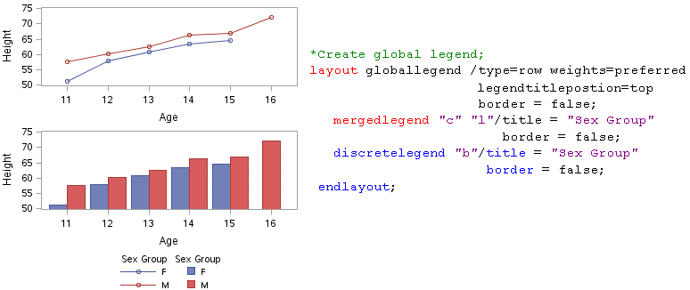
When there are multiple discrete legends are used, you can use LAYOUT GLOBALLEGEND block to combine all of the discrete and merged legends into one global legend. This is also useful when you need to create a plot using more than one cell. Here are some notes that you must pay attention when using global legend.
1) One one LAYOUT GLOBALLEGEND block is allowed for each template.
2) DISCRETELEGEND or MERGELEGEND statements that appear outside of the LAYOUT GLOBALLEGEND block are ignored.
3) CONTINOUS statement is not supported.
TITLE = option can not only be used on each of the DISCRETELEGEND or MERGEDLEGEND statement to add titles for each individual legend. It can also be used to add tiltle for global legend. TYPE = option determines how to arrange the legends. When TYPE = ROW, the legends are arraged in a row and in this case, you can specify the amount of space that is available for each of the legends by using WEIGHTS = option. WEIGHTS =UNIFORM tells that all legends are given an equal amount of space. WEIGHTS = PREGERRD tells that each legend is given its preferred amout of space. Another value for this option can be a space-delimited list of numbers. Below is the full code demonstrating how to create a global legend.
Click here to hide/show code
*Define Graph Template;
proc template;
define statgraph line;
begingraph;
layout lattice;
*Create 1st line plot;
layout overlay/yaxisopts=(label = “Height”
offsetmin = 0.02
offsetmax = 0.02
linearopts =(tickvaluelist=(50 55 60 65 70 75)
viewmin = 50 viewmax = 75))
xaxisopts=(label = “Age”
offsetmin = 0.02
offsetmax = 0.02
linearopts =(tickvaluelist=(11 12 13 14 15 16)
viewmin = 11 viewmax = 16));
scatterplot x=age y=mean/group = sex name = “c” ;
seriesplot x=age y=mean/group = sex name =”l” ;
endlayout;
*Create 2nd bar chart;
layout overlay/yaxisopts=(label = “Height”
offsetmin = 0.02
offsetmax = 0.02
linearopts =(tickvaluelist=(50 55 60 65 70 75)
viewmin = 50 viewmax = 75))
xaxisopts=(label = “Age”);
barchart x=age y=mean/group = sex groupdisplay = cluster
name = “b” ;
endlayout;
endlayout;
*Create global legend;
layout globallegend /type=row weights=preferred
gendtitleposition=top
border = false;
mergedlegend “c” “l”/title = “Sex Group”
border = false;
discretelegend “b”/title = “Sex Group”
border = false;
endlayout;
endgraph;
end;
run;
*Create Output Data;
proc sort data = sashelp.class out = class;
by sex age; run;
ods exclude all;
proc means data = class mean noprint;
by sex age;
var height;
output out = dist(drop = _type_ _freq_)
mean = mean;
run;
ods exclude none;
*Associate ODS style, Graph template to Output Data;
ods graphics / width=350px height = 340px border = off ;
proc sgrender data=dist template=line ;
run;
ods graphics off ;
After submitting above code, we will get a figure like below. Please note that in this case, you don’t need to use placement options such as LOCATION, HALIGN and VALIGN as the order of LAYOUT GLOBALLEGEND block already determines that this global legend will be displayed below line plot and bar chart.
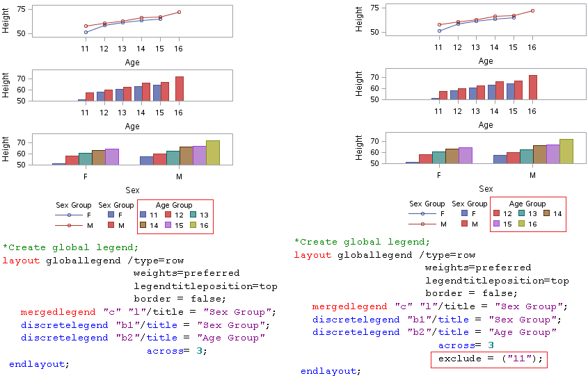
How to remove legend items from a discrete legend
Here is an example which has three plots.
Click here to hide/show code
*Define Graph Template;
proc template;
define statgraph line;
begingraph;
layout lattice;
*Create 1st line plot;
layout overlay/yaxisopts=(label = “Height”
linearopts =(tickvaluelist=(50 55 60 65 70 75)
viewmin = 50 viewmax = 75))
xaxisopts=(label = “Age”
linearopts =(tickvaluelist=(11 12 13 14 15 16)
viewmin = 11 viewmax = 16));
scatterplot x=age y=mean/group = sex name = “c” ;
seriesplot x=age y=mean/group = sex name =”l” ;
endlayout;
*Create 2nd bar chart;
layout overlay/yaxisopts=(label = “Height”
linearopts =(tickvaluelist=(50 55 60 65 70 75)
viewmin = 50 viewmax = 75))
xaxisopts=(label = “Age”);
barchart x=age y=mean/group = sex groupdisplay = cluster
name = “b1” ;
endlayout;
*Create 3nd bar chart;
layout overlay/yaxisopts=(label = “Height”
linearopts =(tickvaluelist=(50 55 60 65 70 75)
viewmin = 50 viewmax = 75))
xaxisopts=(label = “Sex”);
barchart x=sex y=mean/group = age groupdisplay = cluster
name = “b2” ;
endlayout;
endlayout;
*Create global legend;
layout globallegend /type=row
weights=preferred
legendtitleposition=top
border = false;
mergedlegend “c” “l”/title = “Sex Group”;
discretelegend “b1″/title = “Sex Group”;
discretelegend “b2″/title = “Age Group”
across= 3;
endlayout;
endgraph;
end;
run;
*Create Output Data;
proc sort data = sashelp.class out = class;
by sex age; run;
ods exclude all;
proc means data = class mean noprint;
by sex age;
var height;
output out = dist(drop = _type_ _freq_)
mean = mean;
run;
ods exclude none;
*Associate ODS style, Graph template to Output Data;
ods graphics / width=350px height = 340px border = off ;
proc sgrender data=dist template=line ;
run;
ods graphics off ;
By using exclude option, we can remove items from a discrete legend. In our example, legend item with value of age equals to 11 was removed.
How to format data and change the legend items
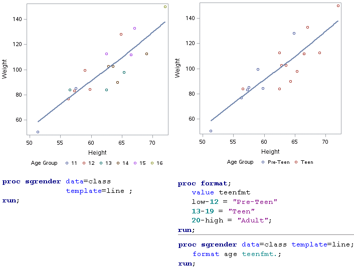
By applying format to a group data, we can change the legend entry label and even the number of legend items. Here is an example to make a scatter plot of WEIGHT over HEIGHT from SASHELP.CLASS.
Click here to hide/show code
*Define Graph Template;
proc template;
define statgraph line;
begingraph;
layout overlay;
scatterplot x=height y=weight/group = age
name = “b2”;
loessplot x=height y=weight;
discretelegend “b2″/title = “Age Group”
down= 1 border=false;
endlayout;
endgraph;
end;
run;
*Create Output Data;
proc sort data = sashelp.class out = class;
by age;
run;
proc format;
value teenfmt
low-12 = “Pre-Teen”
13-19 = “Teen”
20-high = “Adult”;
run;
*Associate ODS style, Graph template to Output Data;
ods graphics / width=350px height = 340px border = off ;
proc sgrender data=class template=line ;
format age teenfmt.;
run;
ods graphics off ;
Without format, we will get a plot like below in the left panel of below figure. You can see that there are 6 legend items and each is for one age. And if we give age a format, the legend entries will be changed based on the pre-format. Since there are only two groups per format and therefore only two legend items are displayed in the right panel.
How to add legend items into a discrete legend
If you look at the figure in previous section, you will notice that we’d like to have three age groups: Pre-Teen, Teen and Adult. However, there are only two groups displayed in the plot eventually. For this missing legend item, is there a way to add manually? Luckily, we can apply LEGENDITEM statement to insert items to our legend. The syntax for LEGENDITEM is as follows:
| LEGENDITEM TYPE = NAME = / options | |
| TYPE = | Specifies the type of entry that you want to add to your legend. The entry type can be as following: LINE MARKER MARKERLINE TEXT |
| NAME = | Specifies the legend item name which will be referenced in DISCRETELEGEND statement |
| Options | It is up to what kind of entry type you specified. These options are meant for the appearance of your legend item such as color, pattern, font and so on. |
For example, in our case, we’d like to add a legend item consists of a circle. And we have to specify TYPE = MARKER and use MARKERATTRS = () to set the appearance of our marker. Please note that LEGENDITEM statement must be placed between BEGINGRAPH statement and the first layout statement.
Click here to hide/show code
*Define Graph Template;
proc template;
define statgraph line;
begingraph;
legenditem type = marker name = “add”/
label = “Adult”
markerattrs =(symbol = circle color = green);
layout overlay;
scatterplot x=height y=weight/group = age
name = “b2”;
loessplot x=height y=weight;
discretelegend “b2” “add”/title = “Age Group”
down= 1 border=false;
endlayout;
endgraph;
end;
run;
*Create Output Data;
proc sort data = sashelp.class out = class;
by age;
run;
proc format;
value teenfmt
low-12 = “Pre-Teen”
13-19 = “Teen”
20-high = “Adult”;
run;
*Associate ODS style, Graph template to Output Data;
ods graphics / width=350px height = 340px border = off ;
proc sgrender data=class template=line ;
format age teenfmt.;
run;
ods graphics off ;
Here is our desired plot which contains entry for Adult group.

Recommended approach to create legend using LEGENDITEM
In clinical industry, we may encouter the situation in which data is missing from an entire group. And thus the entry for this group will not be displayed in legend. However, we programmers are required to add entry for this group. And as time goes on, we have more and more data, we don’t need to have concern on this kind of issue anymore. In order to make code robust and prevent me from paying attention from time to time, I’d like to specify each group using one LEGENDITEM statement and then reference all of them in DISCRETELEGEND statement initially. Here is what I will do for our above example. In order to have full control over my legend item and appearance of my plot, I also applied DISCRETE ATTRIBUTE MAP. Please note that the attributes defined in DISCRETE ATTRIBUTE MAP should be in consistence with those defined in LEGENDITEM statements.
Click here to hide/show code
*Define Graph Template;
proc template;
define statgraph line;
begingraph;
*Discrete attribute map;
discreteattrmap name=”agegrp” / ignorecase=true;
value “Pre-Teen” /
markerattrs=GraphData1(color=red symbol=circlefilled);
value “Teen” /
markerattrs=GraphData2(color=blue symbol=Squarefilled);
value “Adult” /
markerattrs=GraphData2(color=green symbol=Diamondfilled);
enddiscreteattrmap;
discreteattrvar attrvar=ageattr var=age attrmap=”agegrp”;
legenditem type = marker name = “item1″/
label = “Pre-Teen”
markerattrs =(symbol = circlefilled color = red);
legenditem type = marker name = “item2″/
label = “Teen”
markerattrs =(symbol = Squarefilled color = blue);
legenditem type = marker name = “item3″/
label = “Adult”
markerattrs =(symbol = Diamondfilled color = green);
layout overlay;
scatterplot x=height y=weight/group = ageattr
name = “b2”;
loessplot x=height y=weight;
discretelegend “item1” “item2” “item3″/title = “Age Group”
down= 1 border=false;
endlayout;
endgraph;
end;
run;
*Create Output Data;
proc sort data = sashelp.class out = class;
by age;
run;
proc format;
value teenfmt
low-12 = “Pre-Teen”
13-19 = “Teen”
20-high = “Adult”;
run;
*Associate ODS style, Graph template to Output Data;
ods graphics / width=350px height = 340px border = off ;
proc sgrender data=class template=line ;
format age teenfmt.;
run;
ods graphics off ;
Here is the output plot and you can see that no markers have green color but we do have green markers in legend entries.


Pretty nice post. I just stumbled upon your blog and wanted
to say that I have really enjoyed surfing around your
blog posts. After all I’ll be subscribing to your rss feed and I
hope you write again very soon!
Wow that was unusual. I just wrote an extremely long comment but after I clicked submit my comment didn’t appear.
Grrrr… well I’m not writing all that over again. Anyhow, just
wanted to say superb blog!
very nice, i want to learn it